Basic Statistical Analysis
Univariate dataset
Here we will look into some simple (univariate) dataset, and see how can we statistically describe the dataset. We work on a Jupyter notebook. First let us load the python libraries we will be using:
import matplotlib.pyplot as plt
import pandas as pd
import seaborn as sns

# some matplotlib configs
%matplotlib inline
plt.rcParams["figure.dpi"] = 150
plt.rcParams["figure.facecolor"] = "white"
Let us load our dataset of human heights (in inches). The dataset contains more columns (variables), but we will be looking only in the height.
data = pd.read_csv("../datasets/height-weight.csv", usecols=[1])
data.head()
And we will see an output like below. You can also pass an argument to the
head method (e.g., data.head(10)) to display certain number of rows instead
of default 5.
   Height(Inches)
0        65.78331
1        71.51521
2        69.39874
3        68.21660
4        67.78781
We can a get a summary of our data using pandas describe method:
data.describe()
       Height(Inches)
count    25000.000000
mean        67.993114
std          1.901679
min         60.278360
25%         66.704397
50%         67.995700
75%         69.272958
max         75.152800
Now let us try to understand what these various quantities means.
Count, min and max
Count is the number of data points we have in our dataset. Min and max are the lowest and highest values of data points, respectively.
Mean and standard deviation
We have seen previously how they are defined.
Mean gives us an idea where our data is centered around. Standard deviation
tells us how our data is distributed or spread. 66.67% of our data points falls
in the range mean ± std, about 95% of our samples falls in the range
mean ± 2*std and 99.7% of our data falls in the range mean ± 3*std. Standard
deviation is the average distance our data points fall from the mean value.
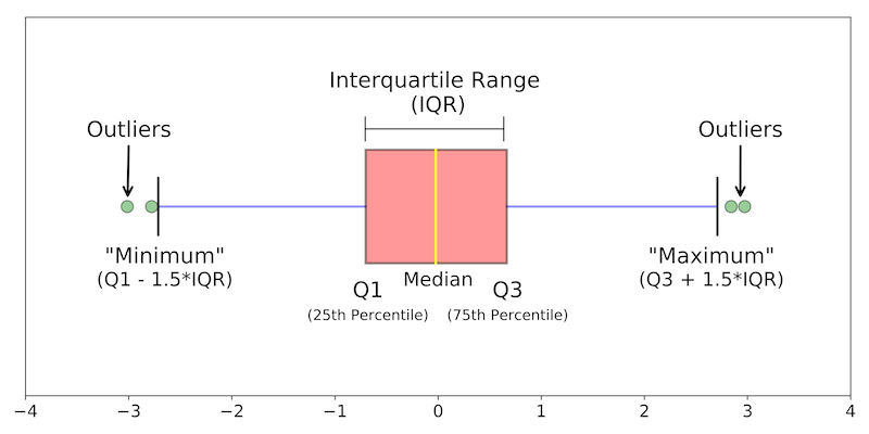
Inter quartile ranges
The quantities 25%, 50%, and 75% are inter quartile ranges, sometimes referred to as first, second, and third quartile as well. Second quartile is also known as median. First quartile gives the value where 25% of data points falls below. Inter quartile range is defined as the (3rd quartile - 1st quartile); in our case (69.272958 - 66.704397) = 2.568561. This also describes how hour data points are distributed. Range is defined as (max value - min value).
In case of symmetrical dataset, the mean and median will have the same value. If the data is right skewed, the mean will be higher than median. Conversely, if the data is left skewed, the average will lower than the median.
Standard score or z-score
Standard score or z-score of a specific data point is given by
Histogram plot
Histogram plot can give us good indication about mean, median, data distribution, ranges of our dataset. Here we will use seaborn to make plots.
sns.histplot(data, x="Height(Inches)", bins=20)
plt.show()
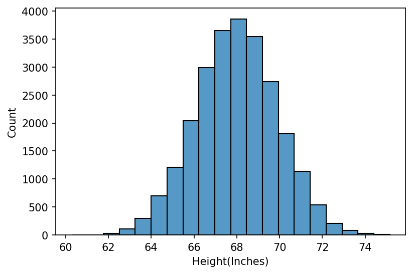
We can infer from the histogram plot that our data is symmetrical with a bell- shaped (normal) distribution, centered around 68 inches, has range from 62 to 75. The distribution is unimodal (it has only peak. If there are two peaks, we call it bimodal).
In case of univariate data, we can also plot a smooth distribution curve (kernel
density plot) along with the histogram by setting the kde parameter to True.
sns.histplot(data, x="Height(Inches)", bins=20, kde=True)
Main aspects of histogram plot:
- Shape: overall appearance of histogram; could be symmetric, bell shaped, left skewed or right skewed, etc.
- Center: mean or median. In order to find the median, we can draw a vertical separator line such that the area under the curve on the left and right are equal.
- Spread: how the data is distributed. Range, Interquartile Range (IQR), standard deviation, variance.
- Outliers: data points that fall far from the bulk of the data. If the data is say, right skewed (long tail on the right), likely there will have outlier on the right as well.
Box plot
sns.boxplot(data=data["Height(Inches)"])
plt.show()
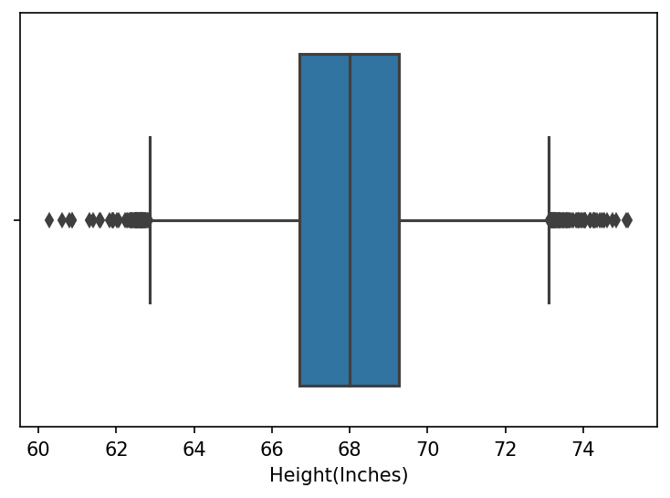
Important parts of the box plot is described in the diagram below:
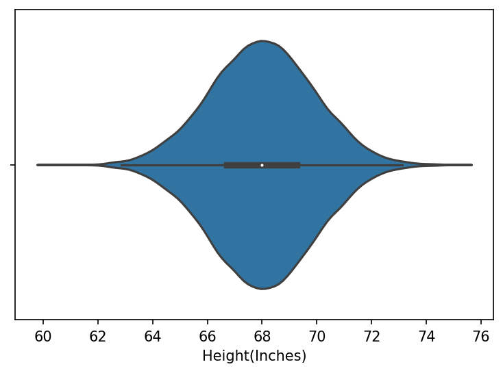
Violin plot
sns.violinplot(x=data["Height(Inches)"])
plt.show()
Q-Q plot
Quantile-quantile plot.