Data visualization
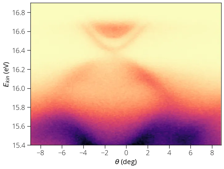
This example provides basic example of image plot using matplotlib. There is a huge list of customization possible using matplotlib. You can consult matplotlib documentation for advanced customizations.
import arpespythontools as arp
data, energy, angle = arp.load_ses_spectra('sample_spectra.txt')

# Plot image
import matplotlib.pyplot as plt
%matplotlib inline
# Above line is specific to Jupyter Notebook
plt.figure(figsize = (8, 6))
plt.imshow(data, origin = 'lower', aspect = 'auto', \
            extent = (angle[0], angle[-1], energy[0], energy[-1]))
plt.xlabel("$\\theta$ (deg)")
plt.ylabel("$E_{kin}$ (eV)")
plt.set_cmap('magma_r')
plt.show()
You should see a plot like this upon successful execution:
Crop image
We can crop images (two-dimensionl data) using the crop_2d function. Say, we
want to crop and focus only on the Dirac cone part. We want to crop the energy
range (16, 16.8) and angle range (-6, 4).
# data_crop, x_crop, y_crop = crop_2d(data, x, y, x_min, x_max, y_min, y_max)
data_crop, x_crop, y_crop = arp.crop_2d(data, x, y, 16, 16.8, -6, 4)

plt.figure(figsize = (8, 8))
plt.imshow(data_crop, origin = 'lower', aspect = 'auto', \
            extent = (y_crop[0], y_crop[-1], x_crop[0], x_crop[-1]))
plt.xlabel("$\\theta$ (deg)")
plt.ylabel("$E_{kin}$ (eV)")
plt.set_cmap('magma_r')
plt.show()
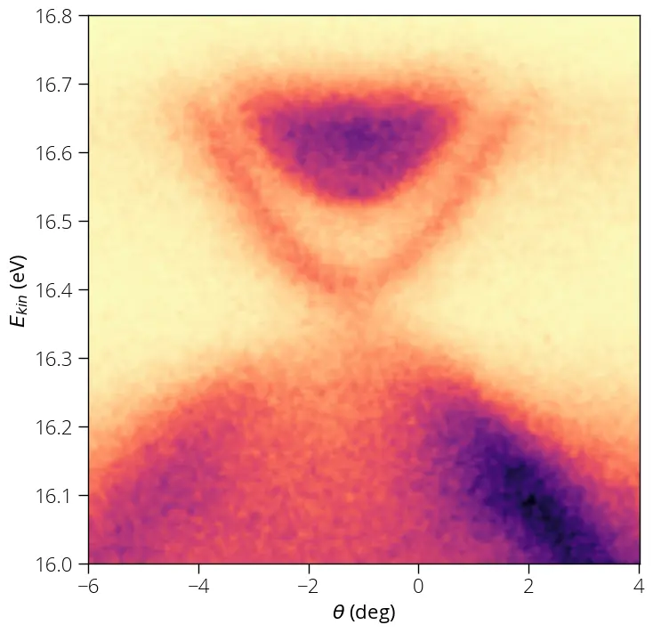
That's what we wanted to achieve.
tip
For advanced 3D visualization of Fermi map data, you may have a look at this example from my Python tutorial.